Python Utilities
Navigation: User Guide ➔ COM Automation ➔ Python Automation ➔ Python Utilities
Python has lots of powerful libraries for data manipulation, plotting, and analysis. These are some examples of what can be done
Plotting Thermophysical Data
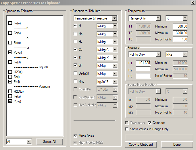
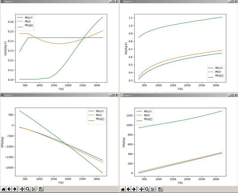
We can generate thermophysical data using Species Property reports when viewing species data: here we select all the different phases of a particular species and plot the specific heat, entropy, enthalpy and Gibbs free energy:
The data is put in the clipboard, and it is easy to access the data directly from the clipboard and plot it:
This script demonstrates accessing the clipboard, using numpy to read blocks of text data into arrays, and then plotting this, along with labels and legends.
import win32clipboard as wcb
import numpy as np
import matplotlib.pyplot as plt
from io import StringIO
import os

blanklinesep=os.linesep+os.linesep    ## Empty line for split

def readCB():
    #'''Read data from the clipboard'''
    wcb.OpenClipboard()
    data = wcb.GetClipboardData()
    wcb.CloseClipboard()
    return data.strip().split(blanklinesep)  ## split on empty lines

def main():
    #'''Each data block has three header lines indicating property, pressure and species'''
    pd = readCB()
    for i, z  in enumerate(pd):
        s = StringIO(z)     ## StringIO makes a 'file like' object from a string
        yvar = s.readline().strip()  ## The independent variable
        pvar = s.readline()  ## the pressure
        vvars = s.readline().strip().split("\t")   ## Temperature units and species
        ddata = np.loadtxt(s, unpack = True)
        xdata, ydata = ddata[0], ddata[1:]
        plt.figure(i+1)
        for j, yy in enumerate(ydata):
            plt.plot(xdata, yy, label = vvars[j+1])
            plt.xlabel(vvars[0])
            plt.ylabel(yvar)
            plt.legend()
    plt.show()


if __name__ == "__main__":
    main()
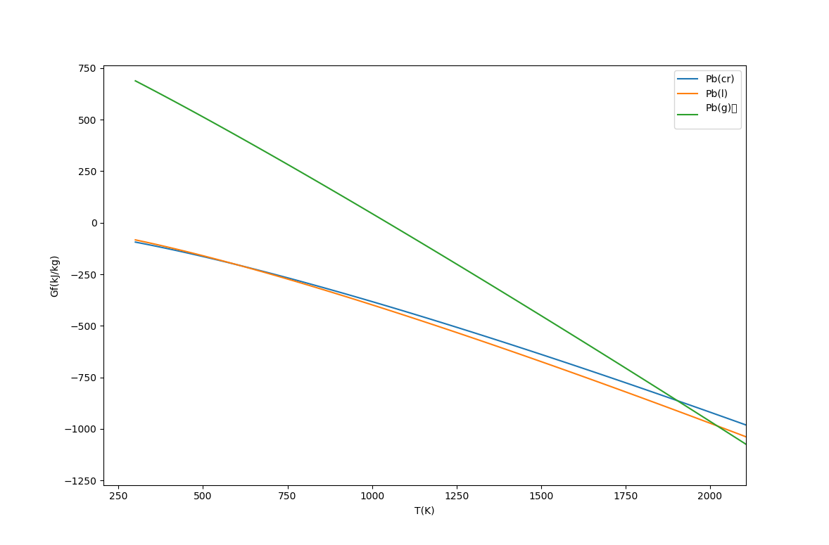
In particular the Gibbs function curves for the phases intersect at the melting and boiling points. At low temperatures the solid (cr) phase has the lowest free energy, and as the temperature increases, the liquid and then vapour phases have lower free energy.
Plotting Species Flows
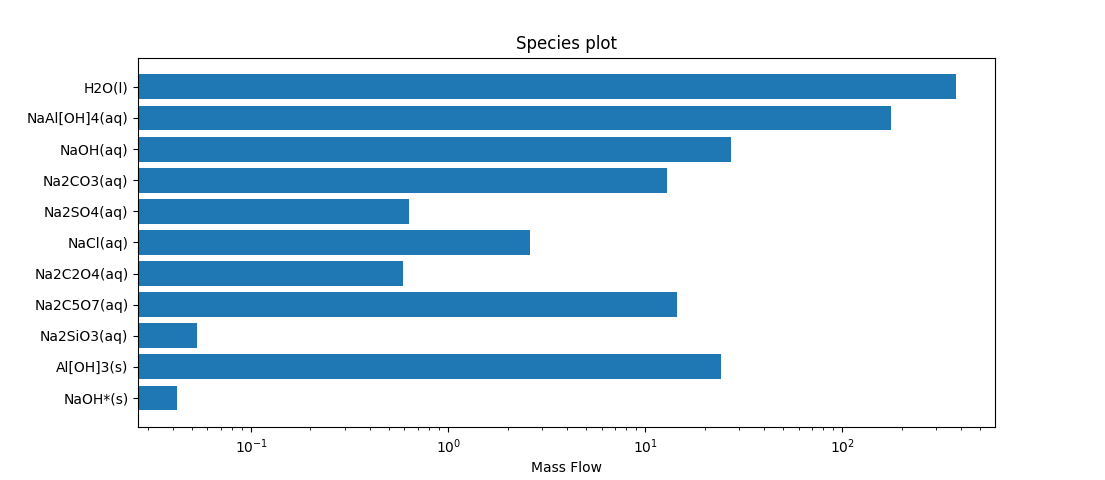
As well as the usual plots we can create bar or pie charts. The Qo tab on any stream has the option to copy the species to the clipboard, so we can create a chart showing the species flows.
from io import StringIO
import matplotlib.pyplot as plt
import numpy as np
import win32clipboard as wcb

wcb.OpenClipboard()
cbtxt = wcb.GetClipboardData()
wcb.CloseClipboard()

res = np.loadtxt(StringIO(cbtxt), dtype = {'names': ('species', 'unit', 'value'),
                                           'formats' : ('U30', 'U10', 'f8')}, skiprows = 2)
v = res['value']
sp = res['species'][v>0]   ## species with non-zero flows
fig, ax = plt.subplots()
y_pos = np.arange(len(sp))
ax.set_xscale('log')
ax.barh(y_pos, v[v>0], align='center')
ax.set_yticks(y_pos)
ax.set_yticklabels(sp)
ax.invert_yaxis()  # labels read top-to-bottom
ax.set_xlabel('Mass Flow')
ax.set_title('Species plot')

plt.show()
- This shows using structured arrays in numpy, which is useful when we have mixed data types, in this case string data for the species, and numerical data for the flows.
- The notation v[v>0] is showing use of an index array.
- v>0 is an array of flags indicating which elements of the array v are non-zero.
>>> v>0
array([ True,  True,  True,  True,  True,  True,  True,  True, False,
       True, False,  True, False, False, False, False, False, False,
      False, False, False, False, False, False, False, False, False,
      False, False, False, False, False, False,  True, False, False,
      False, False, False, False, False, False, False])
- When we use an array as an index, it returns just the elements for which the index array are True, i.e. the non-zero elements of the original array.
 >>> v[v>0]
 array([3.75694246e+02, 1.76991503e+02, 2.72699554e+01, 1.28469206e+01,
      6.32469251e-01, 2.60232738e+00, 5.87385513e-01, 1.45618792e+01,
      5.32841733e-02, 2.42947148e+01, 4.20754018e-02])
- Similarly res['species'] is an array of strings having the species names, while res['species'][v>0] is an array of names of species with non-zero flow.
- We plot this on a logarithmic scale to show relative magnitudes of the flows of the species.
Plotting PSD Data
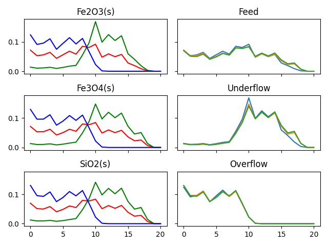
Size distribution data comes in many variations, and when you have multiple ores and streams, there are many different ways to plot the data. Here is an example of plotting the same data by stream and by ore:
import numpy as np
from io import StringIO
import win32clipboard as wcb
import matplotlib.pyplot as plt
wcb.OpenClipboard()  ## data in clipboard as columns for each stream
data = wcb.GetClipboardData()
wcb.CloseClipboard()

X, Y, Z = np.loadtxt(StringIO(data), skiprows = 1, unpack=True)
X = X.reshape((3, -1))
Y = Y.reshape((3, -1))
Z = Z.reshape((3, -1))

plt.ion()
fig, ax = plt.subplots(3, 2, sharex = True, sharey = True)
titles = ["Fe2O3(s)","Fe3O4(s)","SiO2(s)",]
cols = ["r-", 'g-','b-']
for i, t in zip(range(3), titles):#
  for a, c in zip([X, Y, Z], ["r-", 'g-','b-']):
    ax[i, 0].plot(a[i], c)#
  ax[i, 0].set_title(t)

titles = ["Feed","Underflow","Overflow",]
for i, a, t in zip(range(3), [X, Y, Z], titles):
  for j in range(3):
    ax[i, 1].plot(a[j])
  ax[i, 1].set_title(t)

plt.tight_layout()
plt.show()
