Discussion: Ternary Saturation Diagrams using PHREEQC
Navigation: Product Blog ➔ Discussion Pages ➔ Ternary Saturation Diagrams using PHREEQC
Related Links: Potash Solubility, PHREEQC
NOTE: The following Discussion Page uses Potash processing with PHREEQC TCE as an example, but is equally applicable to any complex system of multiple dissolved and solid species with any thermodynamic equilibrium solver.
Potash Ternary System
Potash modelling involves many different solid species - produced by crystallisation and evaporation, or dissolved by leaching or decomposition. A SysCAD Potash flowsheet will include reactions (in one form or another) to follow these species.
Depending on the feed source, there are two main forms in which Potash is produced:
- SOP: Sulphate of Potash - potassium sulphate (K2SO4)
- MOP: Muriate of Potash (from Latin muria meaning brine) - potassium chloride (KCl)
The basic system for MOP in brine are the aqueous species KCl, NaCl and MgCl2 (with H2O as the solvent), though other species and impurities may also be present. In solid form these occur as Halite (NaCl), Sylvite (KCl), Bischofite (MgCl2.6H2O), and Carnallite (KCl.MgCl2.6H2O). Exactly which species are produced in crystallisation depends on brine conditions. As such, a detailed understanding the brine chemistry is key to Potash modelling.
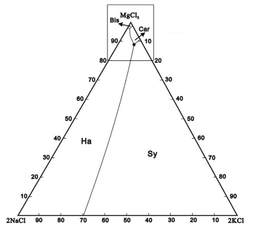
For a single species we could simply plot the solubility vs temperature, but for multiple species things get a bit more complicated. In this example, each of the chloride species affects the solubility of the others via the Common-Ion Effect. A useful method for visualising solubility is to use a Ternary Plot. For MOP brine, the plot to the right shows which solids are formed as the composition of brine varies.
To interpret this diagram, the bottom-left corner is a brine with only NaCl present, and when saturated, Halite will be produced. The bottom-right corner is pure KCl, and this will form Sylvite. Things get more interesting at the top of the picture where high concentrations of MgCl2 will crystallise as Bischofite or Carnallite. Carnallite is typically produced when evaporating sea water (once the magnesium concentration is high enough) and is a key mineral species in Potash production.
There are actually four species present here - the ternary diagram only shows the relative concentrations of the three soluble species and ignores the solvent (water in this case). The diagram only applies for a single temperature and the boundaries between the stable solids will move as the temperature changes. Of particular interest are the triple-saturation points where the boundary lines intersect (noted by ● on the diagram for Halite-Sylvite-Carnallite). We often want to control a brine composition to be near the triple-saturation point, then move the conditions slightly to control precipitation or decomposition of a particular species.
Generating the Diagram
In SysCAD we use Thermodynamic Calculation Engines (TCE) such as PHREEQC to account for all of the different species and their solubilities. Ternary diagrams are useful as a complementary visualisation tool. To validate the use of a particular TCE, it can be helpful to produce a ternary plot and compare to data available from literature or test work. Here we have used SysCAD and PHREEQC, driven by Python through the COM interface, to produce this plot:
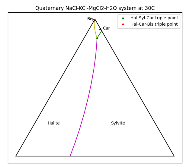
There are certainly mode elegant methods to generate such diagrams, but this was done using a brute-force approach - running models at a range of brine compositions to determine equilibrium, saving the data, then generating the plot.
PHREEQC Modelling
The first step was to create a simple SysCAD model with a PHREEQC side calculation:

Here we have a single source with a specified flow of H2O(l) and the brine components as solids. The water flow is reduced such that the brine is always saturated, but depending on the relative amounts of solids in the feed, the final brine composition changes. We include a General Controller which calculates the relative proportions of the brine species (ignoring the water). A PHREEQC Side Calc Model fetches the stream composition from the pipe and calculates the actual equilibrium. Enabling MapToProdStream and ShowQProd allows you see the brine composition directly. Side calculators like this are very useful when using PHREEQC in a large plant model where one may want to control only a few individual reactions without the full equilibrium calculation that would take place in an in-line PHREEQC Reactor - especially if the reactions are constrained in some way (such as rate dependence or lockup).
Varying the feed solids composition, you see that the product solids change. Interestingly, there may be one, two or three solid species present in the product (but never four). Two solid species correspond to the line boundaries and three correspond to triple-saturation points. Some combinations can never occur - e.g. you never have only Bischofite and Sylvite present, i.e. they do not share a boundary. Using this information we can produce the ternary diagram.
In order to gather the required data, we need to:
- Vary the solids in the feed over the full range of each salt, keeping the total mass of solids fixed.
- Run the model to establish the saturation composition.
- Collect the data to generate the plot.
We could do this manually (for several hundred different compositions), but instead we can use Python and COM automation to do the job. We will do this in two parts - gather the data (and save it), then use the saved data to generate the plot. (We could do it all in one go, but we don't want to rerun several hundred SysCAD models just to fine-tune our diagram.)
Gathering Data with Python
As we vary the feed composition and run the model, we are interested in the brine composition as well as which solids actually remain in the stream. These solid species must be saturated and thus define the regions in the diagram. We vary the feed solids composition by 2 t/h for each of the species involved, covering the full range of possible compositions up to 28 t/h for each species.
import SysCAD.syscadif as syscadif

scc = syscadif.SysCADCom()
scc.getOpenProject()

stags = [
    "XPG_001.Content.QM:Ph.KCl(s) (t/h)",
    "XPG_001.Content.QM:Ph.MgCl2(s) (t/h)",
    "XPG_001.Content.QM:Ph.NaCl(s) (t/h)",
]

gtags = [
"PSC_001.QProd.QM:IPh.NaCl(s) (t/h)",
"PSC_001.QProd.QM:IPh.KCl(s) (t/h)",
"PSC_001.QProd.QM:IPh.KCl.MgCl2.6H2O(s) (t/h)",
"PSC_001.QProd.QM:IPh.Bischofite(s) (t/h)",
"PSC_001.QProd.MF:IPh.H2O(l) (%aq)",
"PSC_001.QProd.MF:IPh.KCl(aq) (%aq)",
"PSC_001.QProd.MF:IPh.MgCl2(aq) (%aq)",
"PSC_001.QProd.MF:IPh.NaCl(aq) (%aq)",
]

def getData():
    '''Collect all the data and save to a numpy array'''
    res = []
    for i in range(0, 29, 2):
        for j in range(0, 29, 2):
            k = 28-i-j
            if k<0: break
            scc.setTags(stags, [float(x) for x in (i,j,k)])
            scc.run()
            res.append(scc.getTags(gtags))
    rtn = np.array(res);
    with open('test.npy',  'wb') as f:
        np.save(f, rtn)
    return rtn

getData()
|
Note that the basic control of SysCAD via COM is the three lines:
scc.setTags(stags, [float(x) for x in (i,j,k)])
scc.run()
res.append(scc.getTags(gtags))
Here we loop through setting values for the tags in the list stags, running the model, then getting the values from tags in the list gtags. We are using a wrapper around COM, implemented in the module SysCAD.syscadif, which is described in the SysCAD Python documentation.
This initial run showed the broad features of the diagram but did not have enough detail in the high MgCl2 region (near the top of the diagram). So we do a separate run for high MgCl2 in the range 20 to 28 t/h.
def getDataHighMg():
    res = []
    for i, mg in enumerate(np.linspace(28, 20, 15)):
        kna = 28-mg
        for k in np.linspace(0, kna, i+1):
            na = kna-k
            scc.setTags(stags, [k, mg, na])
            scc.run()
            res.append(scc.getTags(gtags))
    rtn = np.array(res);
    with open('test1.npy',  'wb') as f:
        np.save(f, rtn)
    return rtn

getDataHighMg()
|
Sorting and Plotting the Data
Now that we have the data (saved in test.npy and test1.npy), we need to generate the plot. We are only interested in data points where solids coexist (i.e. the boundaries between regions), so we go through all of the data, eliminating values that only have a single solid present. A useful trick here is to convert the presence of solids into a signature. E.g. if we have Halite and Bischofite present the signature is (1,0,0,1). These signatures identify the various boundaries in the diagram, and we can ignore any that have only a single solid (for which the sum of the signature is 1). The signatures are also useful in formatting different features of the final plot.
#! python3 -i

import numpy as np
import matplotlib.pyplot as plt
from math import sqrt
from collections import defaultdict

labels = {(1,0,1,1): "Hal-Car-Bis triple point",
          (1,1,1,0): "Hal-Syl-Car triple point",
}
fmtmap = {
          (1,1,0,0): "m",
          (0,1,1,0): "g",
          (1,0,1,0): "c",
          (1,0,0,1): "k",
          (1,0,1,0): "y",
          (0,0,1,1): "b",
          (1,0,1,1): "r.",
          (1,1,1,0): "g.",
}

## corners of ternary diagram
b2 = [0., 0]
b0 = [100., 0]
b1 = [50., 100.*sqrt(3)/2]

bbt = np.transpose(np.array([b0, b1, b2]))
data = np.load('test.npy')
data = np.append(data, np.load('test1.npy'), axis=0)

def toBary(z):
    '''Convert cartesian triple to barycentric coordinate'''
    return bbt@z
def plotDiag():
    dd = defaultdict(list)
    plt.ion()
    for d in data:
        z = d[-3:]/sum(d[-3:])
        xy = toBary(z)
        d4 = tuple(d[:4]>0)
        if sum(d4)<2:
            continue
        dd[d4].append(xy)
    tp1 = dd[(1,1,1,0)][0]  ## triple points
    tp2 = dd[(1,0,1,1)][0]
    print (tp1, tp2)
    dd[(1,0,0,1)].append(tp2)
    dd[(0,0,1,1)].append(tp2)
    dd[(1,1,0,0)].append(tp1)
    dd[(1,0,1,0)].append(tp1)
    dd[(0,1,1,0)].append(tp1)
    d1 = {}
    for k, v in dd.items():
        va=np.array(v)
        d1[k] = va[np.argsort(va[:,1])]
    for k, v in d1.items():
        if np.sum(k)==2:
            X, Y = np.transpose(v)
            plt.plot(X, Y, fmtmap[k])
        if np.sum(k) ==3:
            x, y = v[0]
            plt.plot([x],[y], fmtmap[k], label=labels[k])

    plt.plot(bbt[0], bbt[1], "k", [0, 100], [0, 0], "k")
    plt.annotate("Sylvite", (60,20))
    plt.text(20, 20, "Halite")
    plt.annotate("Car", xy=(52, 80), xytext = (55,80),  arrowprops=dict(arrowstyle="->",
                            connectionstyle="arc3"))
    plt.annotate("Bis", xy = (49.74, 86.12), xytext = (45, 86),arrowprops=dict(arrowstyle="->",
                            connectionstyle="arc3"))
    plt.title("Quaternary NaCl-KCl-MgCl2-H2O system at 30C")
    plt.legend()
    plt.gca().set_aspect('equal')
    plt.gca().get_xaxis().set_ticks([])
    plt.gca().get_yaxis().set_ticks([])
    plt.show()
|
We use a default dictionary to create lists of the compositions each of the boundary/triple points, retrieve these via the signature and then add to the plot. Since the points are generated in a somewhat arbitrary order, we need to sort the data before plotting (otherwise we get lines jumping around the plot). We also add the triple points to appropriate boundary lines. The majority of the code above is just for producing the nice picture. The main sorting loop is as follows:
for d in data:
    z = d[-3:]/sum(d[-3:])
    xy = toBary(z) ## Convert to barycentric coordinates
    d4 = tuple(d[:4]>0)
    if sum(d4)<2:
        continue
    dd[d4].append(xy)
Once we have the plot, we can zoom in on the detail of the high magnesium area:

Visualising the Fourth Dimension
Recall that this is actually a quaternary system, with water being the fourth component. Unfortunately we can only represent three components in a ternary diagram. If we want to see how much water is present at the saturation conditions, we can also add colour. (This is left as an exercise to the reader to polish up your Python matplotlib skills!)

First Posted: 03 October 2023
Reference Build: 139.33873
For questions or feedback, please contact us at [email protected].